The setting of 1962 Baltimore opens the design of Hairspray to some really great and fun color combinations and graphic patterns. These great options guided many of the design choices made by our team of Resident Designers, Julian Wiles and Stefanie Christensen. In fact when we began working on this show we enlisted the help of our summer TheatreWings High School Apprentice Camp. During camp, each student used the research of 1960s graphic patterns to create stencils. They arranged these stencils on brightly colored background panels in different configurations and painted them in contrasting colors. By the end of camp, we grouped the panels in like colors and attached hinges to create these great bright folding screens that will also be able to be used by the acting classes in our theatre school to create settings, entrances and locations. And we had some great designs and color combinations to use in the set for Hairspray.
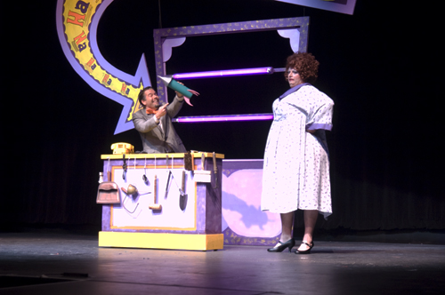
Once we saw the great color combinations, we tagged the ones we knew we wanted to use in the show. You can see the purple, yellow and orange combinations in the Har-de-Har Hut, Maybelle’s shows up in orange and reds with a hint of turquoise. Penny’s bedroom has floating circles in shades of green and blue and Tracy’s bedroom is bright pink and green. And for the school scenes, we created a monochromatic drop in shades of gray overlapping rectangles that we affectionally call the “Retro Drop”. So come check out all the great colors, shapes and patterns onstage for one more weekend, Sept 16th – 19th at Dock Street Theatre.