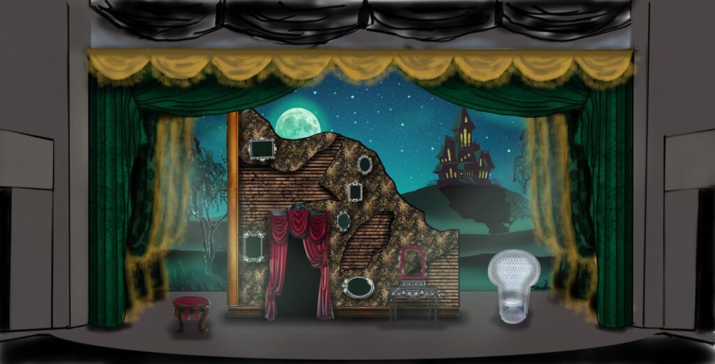
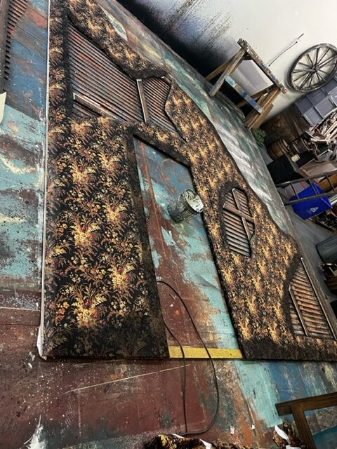
If there’s one thing that’s fun for a scenic designer, it’s a spooky set full of tricks and surprises. Adam Jehle, Charleston Stage’s Technical Director and Resident Scenic & Projector Designer, shares more about his design process for this quirky Halloween show:
What makes “The Addams Family – A New Musical” different from designs you’ve done in the past?
I haven’t done a show with so much outside content and source material before. In my research process I’ve found a treasure trove of ideas–I’ve thoroughly enjoyed going back and looking at the old comics, TV episodes, and movies to find inspiration to make a set design that blends the nostalgic with the new.
What creative inspiration have you been drawing from to make these designs?
The biggest inspiration I drew from was the original Charles Addams and Edward Gorey comics. Their use of texture and scale were striking to me, and I drew heavily on that idea. Another idea I found funny and interesting from the Gorey was the house being in such a dilapidated state, but to the Addams parents that was their perfect version of their house. So naturally peeling wallpaper and dirt stains were a fitting route I went down.
What has been rewarding about designing this show? What has been challenging?
I’ve felt so rewarded in seeing such a large scale show seamlessly come together thanks to everyone’s hard work and thanks to the talented cast, crew, and production staff. The team I work with in the scenic shop is nothing short of amazing, and it makes me so proud to see all that we can build when we come together.
On the flip side, ironically, the scale has been the biggest challenge. With so many locations set in this show, furniture, and props, The Addams Family – A New Musical makes for a massive design challenge to bring all those pieces together cohesively.
What are you eager for audiences to see and notice in your designs when they come to the show?
I want the audience to leave thinking what they saw felt like the true “Addams Family,” with call backs to the original show and vintage comics. But also I want them to feel like the story and set they experienced was a fresh take on this classic series. Our Design Concept for the show is this phrase “Everything is not as it seems.” I hope audiences will take a good look at the set in each scene, because that very well may be true. You’ll be delightfully surprised by all the tricks we have up our sleeves!


